To return to the main Resources menu, click here.
- Scroll down for General Data Visualisation, Individual Data Points, Infographics, and Tables.
I personally use R for data visualisation and so the resources that I use align most strongly with this preference.
General Data Visualisation
-
This preprint on ‘Data visualisation using R, for researchers Who don’t Use R’ offers a practical and pragmatic introduction to data visualisation in R, with visual examples so you can play along at home. There is no requirement for prior experience.
-
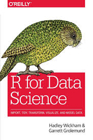
Many people recommend the R for Data Science e-book for people beginning to use R.
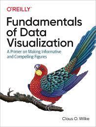
- Specifically for data visualisation, the Fundamentals of Data Visualization e-book is great.
- The infographic below on the principles of data visualisation covers some great generic rules / suggestions (as does this paper) :
Data visualization? Here is a great infographic on the principles of graphics (by Novartis). Please share🙌 #AcademicTwitter #phdchat
— OpenAcademics (@OpenAcademics) October 23, 2020
(Higher resolution can be found and downloaded here: https://t.co/YhtcRoV6dq) pic.twitter.com/FBNK4dxeWq
-
This webinar presents some key principles and worked examples for ‘designing better figures’, with topics including the viewing order, use of text, white space, alignment, colour schemes, and the use of arrows.
-
Often the best way to learn or practise data visualisation is to adapt other people’s code for your specific purpose or play around with some example data. The #TidyTuesday weekly challenge on Twitter is a great example of this. A raw dataset is posted every week with the community visualising the data in many different ways and sharing their code.
This week's #rstats #TidyTuesday attempt - GDPR fines by violation type (not quite as fun as cycling and rap music!)
— Stuart McErlain-Naylor (@biomechstu) April 21, 2020
Any help tidying up the horrendously long and ugly code would be much appreciated as I plan on using it in my research soon.
Code: https://t.co/dUDDuwFrdL pic.twitter.com/qONIzSu8us
- A similar approach is to search for visualisations on Google images and adapt the code from the example that best suits what you are looking for:
Putting together the slidedeck for a talk on improving data visualisation. Here's my favourite tip for finding #Rstats scripts for your plots: Google image search! pic.twitter.com/UFt6DFLph3
— Dan Quintana (@dsquintana) September 2, 2020
-
Asking any questions on Twitter using #RStats will increase your chances of a useful response.
-
This article discusses the advantages and disadvantages of different plot types for presenting specific comparisons visually:
'Bar charts and box plots' - @marc_streit & @ngehlenborg
— Stuart McErlain-Naylor (@biomechstu) June 4, 2021
• difficult to compare categories in pie chart
• stacked bar charts to compare overall values
• layered bar charts to compare within categories
• grouped bar charts to compare across categorieshttps://t.co/sVu1tuqMI5 pic.twitter.com/vzjTQ9twag
-
Daniel Kuhman has a GitHub repository with R scripts for many basic plot types. These can also be adapted for your specific purpose.
-
If you want to include scientific icons within your figures, BioRender is an excellent tool. You can see examples for the human anatomy here – other categories are available. You can also copy and paste individual icons from bioicons.
-
Color Oracle is an app to simulate colour blindness - very useful when designing figures.
-
You can manually edit figures in Matlab (such as the default statistical parametric mapping graphs) with no coding experience:
Individual Data Points
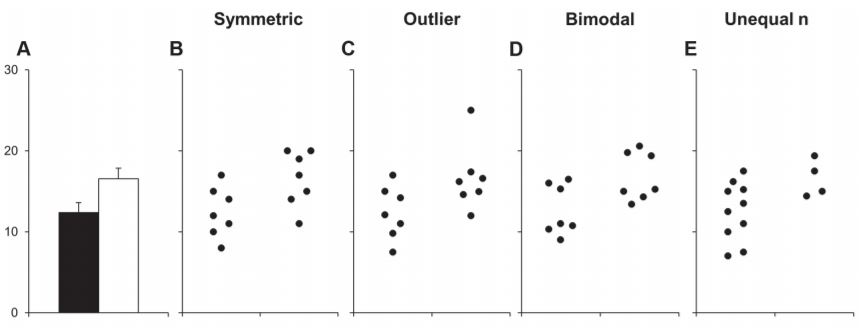
- This paper gives an excellent demonstration of why it is so important to show individual data points within data visualisations.
Infographics
- The 6 min video below by Natalie Erskine covers the key principles behind effective infographic creation:
- The tweet below includes Natalie’s top recommended free tools for content creation:
My top FREE tools for content creation 💪 #scicomm pic.twitter.com/bOhXtqqaQC
— Natalie Rose Erskine 🏃 ♀️🔬 (@sportscicomm) October 18, 2020
- If you’re lucky, HelpMyResearch could design an infographic for your study. Fill out their form and they may get back to you. The one they made for me is below:
💡 𝗪𝗮𝗻𝘁 𝘁𝗼 𝗽𝗿𝗼𝗺𝗼𝘁𝗲 𝘆𝗼𝘂𝗿 𝗿𝗲𝘀𝗲𝗮𝗿𝗰𝗵? 💡@HelpMyResearch1 can help - they created the infographic below for my recent paper (form link in their bio).
— Stuart McErlain-Naylor (@biomechstu) October 13, 2020
Paper link: https://t.co/f7hKjG0JKY pic.twitter.com/GWsqseU7hC
Tables
- Finally, you should not forget that tables are also a form of data visualisation and careful consideration should be given to their design. This Twitter thread presents ten guidelines for better tables:
I recently published "Ten Guidelines for Better Tables" in the Journal of Benefit Cost Analysis (@benefitcost) on ways to improve your data tables.
— Jon Schwabish (@jschwabish) August 3, 2020
Here's a thread summarizing the 10 guidelines.
Full paper is here: https://t.co/VSGYnfg7iP pic.twitter.com/W6qbsktioL


